Mobile Device Management Dashboard
The Problem
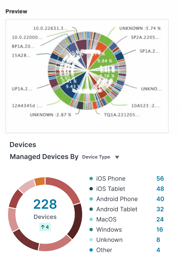
The existing MobileIron Mobile Device Management (MDM) dashboard was outdated and ineffective, making it difficult for IT administrators to quickly assess device health, compliance, and security risks. The primary issue stemmed from cluttered, unreadable graphs, such as pie charts attempting to display data with 25+ segments, leading to poor visibility and decision-making delays.
With Ivanti’s acquisition of MobileIron and the transition to the Ivanti Neurons Cloud Platform, the dashboard needed a modern, intuitive, and insightful redesign. Our goal was to create a more effective data visualization strategy that enabled IT admins to monitor and manage their environments with ease and efficiency.
The goals
Replacing overloaded pie charts
The original dashboard would sometimes have pie charts that attempted to display 20+ data points at once, making them nearly impossible to interpret. IT admins struggled to extract meaningful insights, as the cluttered segments blended together and lacked clear differentiation.
To address this, we replaced the overloaded visuals with clearer data representations, including bar charts for easy comparison of device status and risks, trend lines to highlight historical patterns for proactive issue management, and summary cards that surfaced key insights at a glance, minimizing the need for deep report analysis.
Prioritizing key metrics
The previous dashboard lacked focus, making it difficult for IT admins to quickly find critical data. To improve visibility, we prioritized essential metrics like device health, security risks, and compliance status. Color-coded alerts highlighted urgent issues, a dedicated compliance section surfaced out-of-policy devices, and streamlined security risk assessments provided clear insights without overwhelming detail.
We introduced a modular, customizable dashboard to accommodate diverse IT admin needs. Users could tailor their layout, rearrange and resize widgets, and drill down into data for deeper insights when needed. This flexibility ensured a balanced experience, offering both high-level overviews and detailed analysis, making the dashboard more adaptable and user-friendly.
Introducing a modular, customizable layout
Aligning with the Ivanti Neurons design system
We aligned the dashboard with the Ivanti Neurons design system to create a cohesive, modern experience. This involved standardizing UI patterns, typography, and interactions, simplifying navigation to match other Neurons products, and enhancing accessibility and readability with improved contrast and clear iconography. By ensuring consistency, we reinforced brand cohesion and made adoption easier for existing Ivanti users.


